SaasA Communication Workflow Builder
Role: Lead DesignerFor tech gurus, automated mass texting can be a head-scratcher. But for overworked church staff, bright-eyed student volunteers, and little old ladies working 3-hour shifts at a non-profit desk, it can be a day-ruiner.
Bad UX is not an abstract design problem for these users; it keeps them from connecting with their communities.
At Clearstream, I spend a lot of time thinking about how to make those very real people's lives easier. As part of this, I redesigned Clearstream's automated communication builder: Keyword Workflows. This was a months-long project with complicated edge cases.

Challenges
The builder steps were obscure, hidden behind a dropdown in a complex modal.
Once steps were added, the steps were visually indistinct, requiring a lot of squinting and scrolling to get a big-picture view of the workflow.
Conditional branching was messy, complicated and esoteric.
There was no efficient way to add new steps to the workflow or organize the structure.

Keyword Workflows, circa 2021
👆 I’ve generally use Whimsical for wireframing, but I still enjoy a quick hand-done wireframe for in-meeting exploration and play.
Exploration & Solutions
Wrangling 9 steps, branches, and a wait feature
After digging through months of customer support chats (shoutout to Intercom) and playing with other automated series builders (shoutout to Intercom again!) I pitched a few different ideas:
Digging the two main categories of actions (Step, Branch), out from under their complex modal, and introducing a step (Wait) as primary level CTAs, for easy access.
Visually distinct visual steps with unique icons and colors. Color and icon variety ensured that all users (even color blind or visually impaired) could quickly find steps.
Introducing visual branching in the workflow to make conditional steps identifiable at a glance.
Introducing drag-and-drop + delete functionality for all steps, allowing for rapid reorganization and editing.
During this process, I explored and then scrapped a floating side step menu. Wireframing & prototyping were essential steps for testing out the look and feel of a modal vs. slide-over menu.
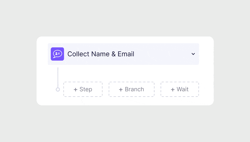
Add Step, Branch or Wait
The 11 possible step actions fell into two primary categories: Adding an internal step or conditionally branching. Within many of these steps, you could customize a delay, but it was tucked into the individual steps additional settings, and not visually clear.
I brought these options out from behind a modal and made the delay its own action.
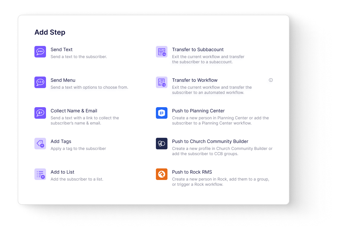
Visually identifiable steps, (even for color-blind users)
I grouped the 10 possible steps into 3 types of actions — actions that directly affected the user, internal actions, and actions connected to an external integration.
I color-coded each of these groups for quick visual scanning, gave them their own icons, and matched the external integration branding.
Conditional Branching:
Zapier's conditional branches were a huge point of inspiration. They guided us towards an else/if format. Users needed to quickly see where their workflow branched, how many steps were included in that branch, and where (or if) that branch returned to the main workflow.
Now, branches weren’t just the word “Conditional Branch” users had to read through the steps to find, they were an actual branch in the workflow UI.

Results
In the year after the workflow redesign was launched, the builders usage increased by 81%.
Customers praised the added builder functionality, and requests for help quieted down for our support team. However, requests for new builder features increased — customers understood our team was listening and responsive, actively integrating their feedback.
Our users now have the convenience of viewing their options, rearranging steps, and getting a quick snapshot of their workflows. This enhanced user experience has allowed them to plan thoughtful, personalized text interactions, fostering real connections with their communities.