B2B SaasFrom Overwhelming to Effortless: Rapid Form Creation
Role: SENIOR DesignerIn 2024, I joined the ServiceNow as a Senior Product Designer. Their Mobile App Builder (MAB) enables users to configure and create enterprise native mobile apps with ease without needing a team of developers.
Here's where things get meta: Our users use our form-based builder to develop apps that often contain forms for *their* users—creating forms... with forms. My job was to dig into the nitty-gritty details and make this process feel lighter, brighter, and smoother.

Challenges
Form Screens are vital for capturing data in mobile apps, but creating them was frustratingly complex. In MAB, users faced numerous hurdles:
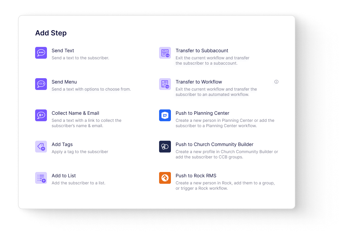
Too many steps: To add a single input field, users must navigate through 35 decision points spread across 5 pages, each involving selecting from 7 different input types, with 26 different attributes. The user journey was unclear and overly complicated.
Confusing choices: The characteristics for the different input types were written in developer-speak, making it difficult for non-technical users to understand their options.
Repeat work: The user had to re-specify data parameters at every step. We had the backend information to pass on the parameter info but weren't using it. Instead, we made the user do that work.

The User journey, circa 2024
Insights
After initial research and feedback, I recognized several pain points:
The user journey assumed excessive customization at every step, leading to unnecessary complexity. Users didn't need to customize everything at every step. Handling those decisions automatically would save time and brainpower.
The platform could automatically handle certain decisions the user had been specifying manually, so let the platform do the heavy lifting!
Solution
My approach was to rethink how the entire form creation process was structured. I proposed a smart guided setup that significantly simplified the experience.
Users could first select the database they were working with and then quickly choose the fields they wanted to update, keeping their decisions to a minimum.
Holistic management of inputs
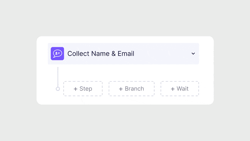
Instead of breaking the input process into individual components (field type, content, and behavior), we allowed users to manage each input as a whole. This way, they could see the whole form and easily make sure everything was in place
Reduced decisions
By taking advantage of the data, we were able to reduce 35 decision points across 5 pages, and turn it into two pages with 3-5 decision points.
Without loosing any of the power or functionality.

Results
The redesign is still in development, but we expect big wins! By streamlining the form creation process, we're making it easier for users to create the apps they need—without pulling their hair out. Stay tuned for the results, but we're confident that we will see much less frustration and many more happy users.